A New Take on
Modern Dental Office Design
Canary Dental
Canary Dental is Dr. Komal Lamba’s first dental practice and she wanted to create a modern dental office experience like no other: a clinic that animates the street, contributes positively to the neighbourhood, and one that not just meets the needs of patients and staff, but also delights those walking by it on the street.
Location: Canary District, Toronto, Ontario
Type: Commercial | Dental Office
Property Size: 1200 Square feet
Architecture and Design: Before and After
Architectural Challenges
Like most interior design projects, the construction phase can be incredibly rewarding and incredibly stressful. You never know what’s waiting for you until you start.
Zoning Challenges
Soon after acquiring the space, our client was notified by the city of a major zoning issue. The municipality had a service-to-retail ratio restriction, and there was no remaining allowance for a service-based dental practice in her location.
To solve this, We represented our client in The Committee Of Adjustments hearing, a process that took 6 months to have the space rezoned for business and personal service occupancy. The community was also surveyed whether they would like having a dental clinic in that location, which was very well received for this neighbourhood.
Bringing In Natural Light
Another challenge we encountered was bringing in natural light. The space is very narrow with windows at the front and back of the unit, so how do we bring in the natural light and connect the spaces together?
Our solution was to organize the interior with a long corridor and link the front and back windows together with pendant lights. Our client wanted to honour her dad and the Canary District by incorporating the symbolic bird through the clinic. Based on her wishes, we designed 28 pendants, some with lights, to resemble bird-like sculptures flying throughout the office.
Our Approach
To achieve a balance between function and design in one of Toronto’s narrow spaces, we knew that the best approach was to simplify the layout to make it more efficient and open up the interior. This approach allowed us to take full advantage of the space available and bring as much natural light in as possible.
With this new take on modern dental office interior design, we were able to create a unique dental clinic by combining one cohesive concept, while meeting our client's needs with a fresh yet functional space that our client was seeking.
Dental Office Design
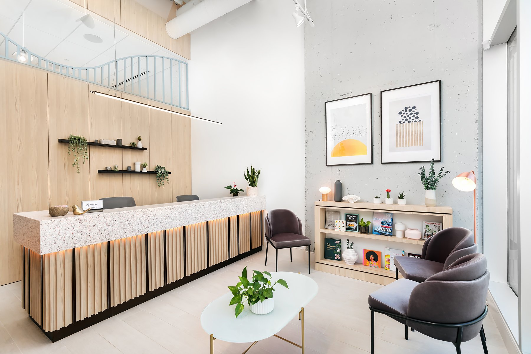
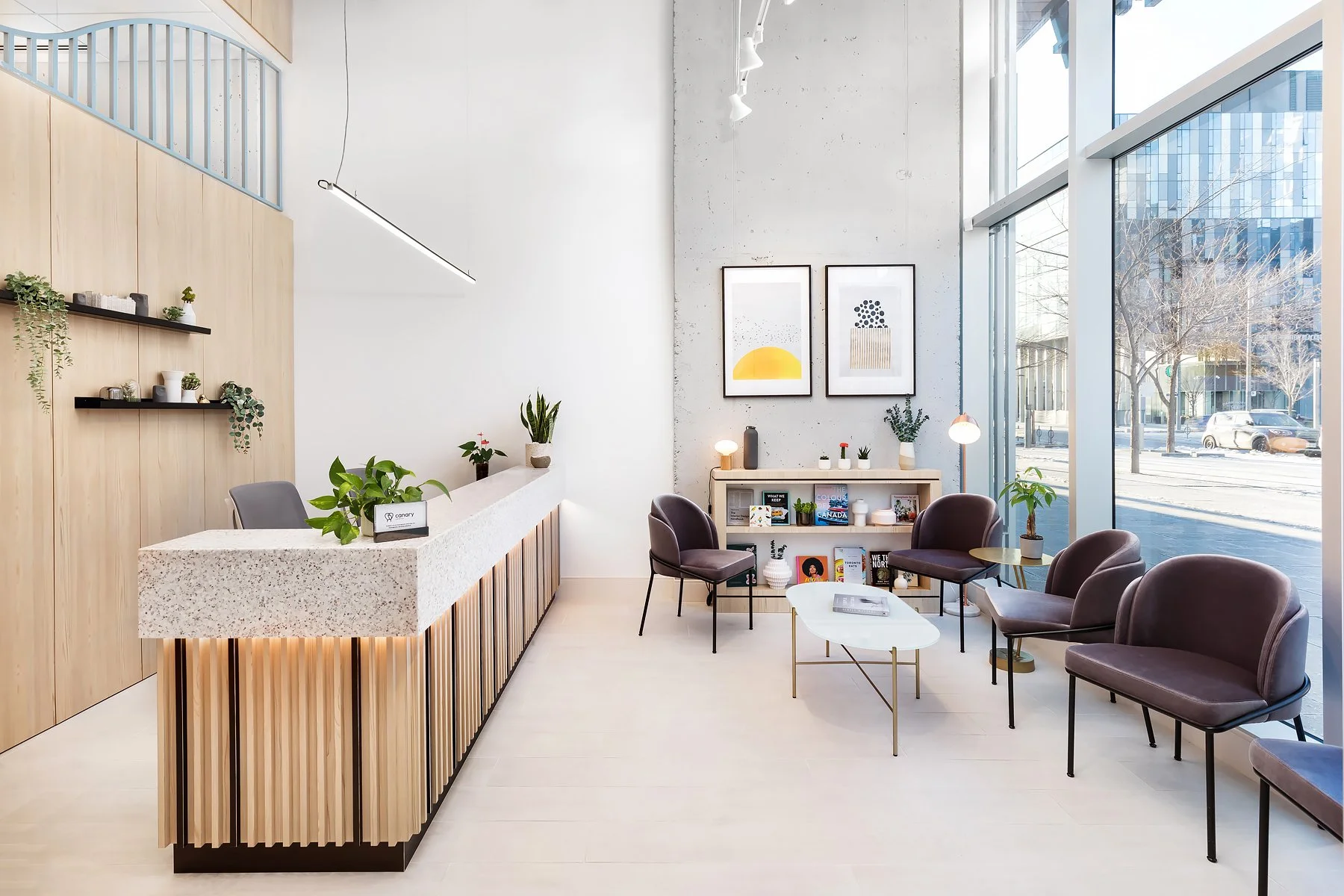
The concept was inspired by our client’s passion for nature, and chic restaurants. The dentist wanted the space to feel welcoming, where she could serve her local community and bring them warmly together. With that in mind, we designed the reception to have a relaxing lounge-like atmosphere where patients are greeted with warm tones.
Our goal was to create a unique, modern dental office design that will provide patients and staff with exceptional experiences. Given the opportunity, we were determined to animate the street, and focus on the details to make sure all aspects of the clinic had their own special attributes and details.
Architectural Drawings
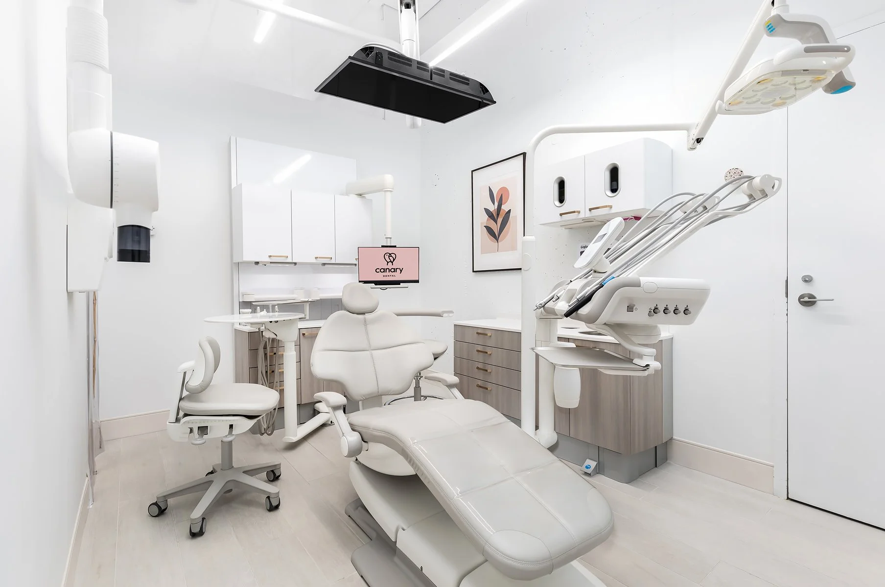
Attending the client’s wishes, and to ensure the practice is profitable, the floorplan had to include four operatories together with its supporting rooms of sterilization, lab, consultation, staff, and utility.
We designed the clinic to have all the operatories on one side, and the secondary functions on the other side. This way we were able to have a clear corridor from the front all the way to the back, which allowed the natural light to flow in from both window-covered sides, giving the impression of a larger space.
This open layout created an organized and functional space without sacrificing the look that our client wanted.
Build
We fully customized the reception counter and cabinets to have a terrazzo countertop and vertical wooden slats, making the space feel dynamic and lively, then we complemented it with plants throughout the clinic, to have a natural feel to it, and brought it all together with metallic verticals and customized metallic bird-like features incorporated into the lighting for a natural flow.
We added a soft curve feature and an arch doorway entrance to represent connection and community. And to align with the clinic’s branding, the colour palette consisted of cool calming tones (pink and blue) with a hint of yellow in the artwork that is hanging on the walls.
The Final Result: A Modern Dental Office Design
Once complete, the clinic was able to meet the client’s need for four operatories, supporting rooms, and a clinic that is welcoming and unique. It had everything she needed and wanted in one cohesive space, without sacrificing the look or the function.


Testimonial
“Working with Prop has been an absolute delight. Every step of the way they went above and beyond all my wishes and expectations. I hired them for both architecture and interior design for my dental clinic and I am very thankful that I did.
They helped me greatly to secure construction permits and their expertise and diligence helped put me at ease. They are exceptional at maximizing the use of a space and bringing in natural light to make the space feel welcoming. They understood my vision clearly and paid attention to every detail.
Prop delivered a design that makes people take notice. Because of the uniqueness of their design, I have increased my clinic’s patient count significantly. I would highly recommend them to all my friends and family. I look forward to our next project whether it be my house or a second clinic, just to work with Prop again!”


